Electre
Branding and website
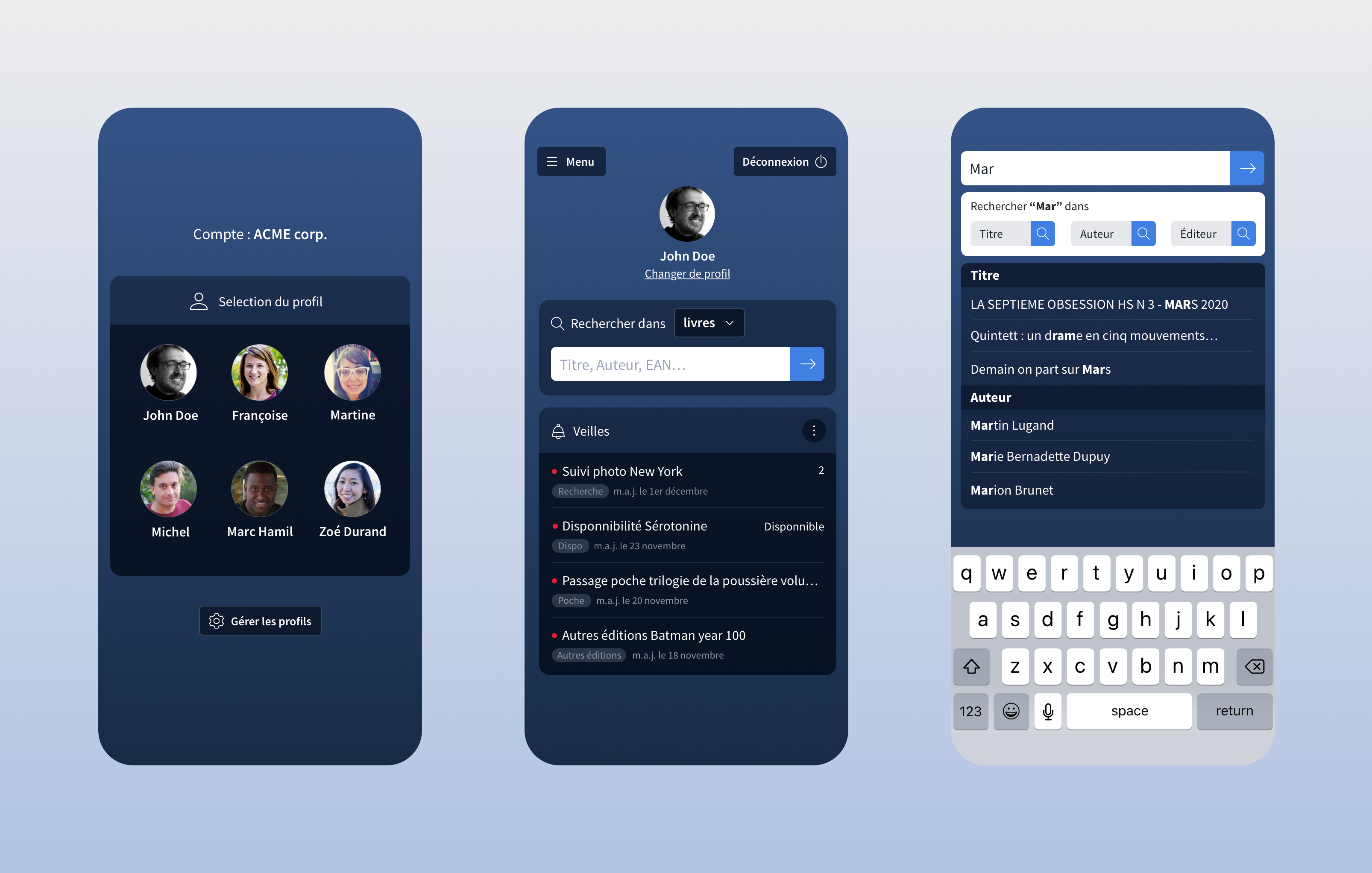
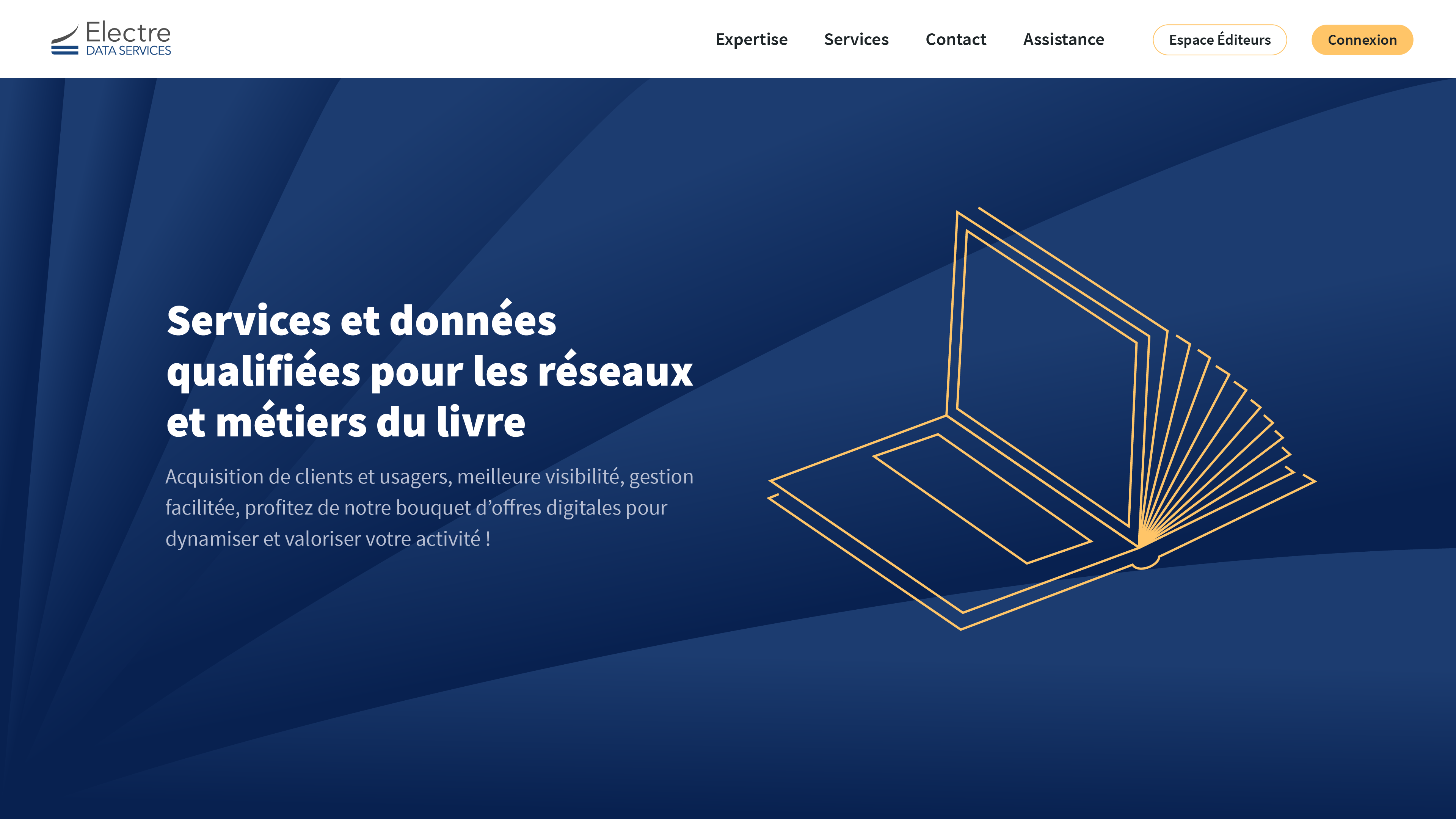
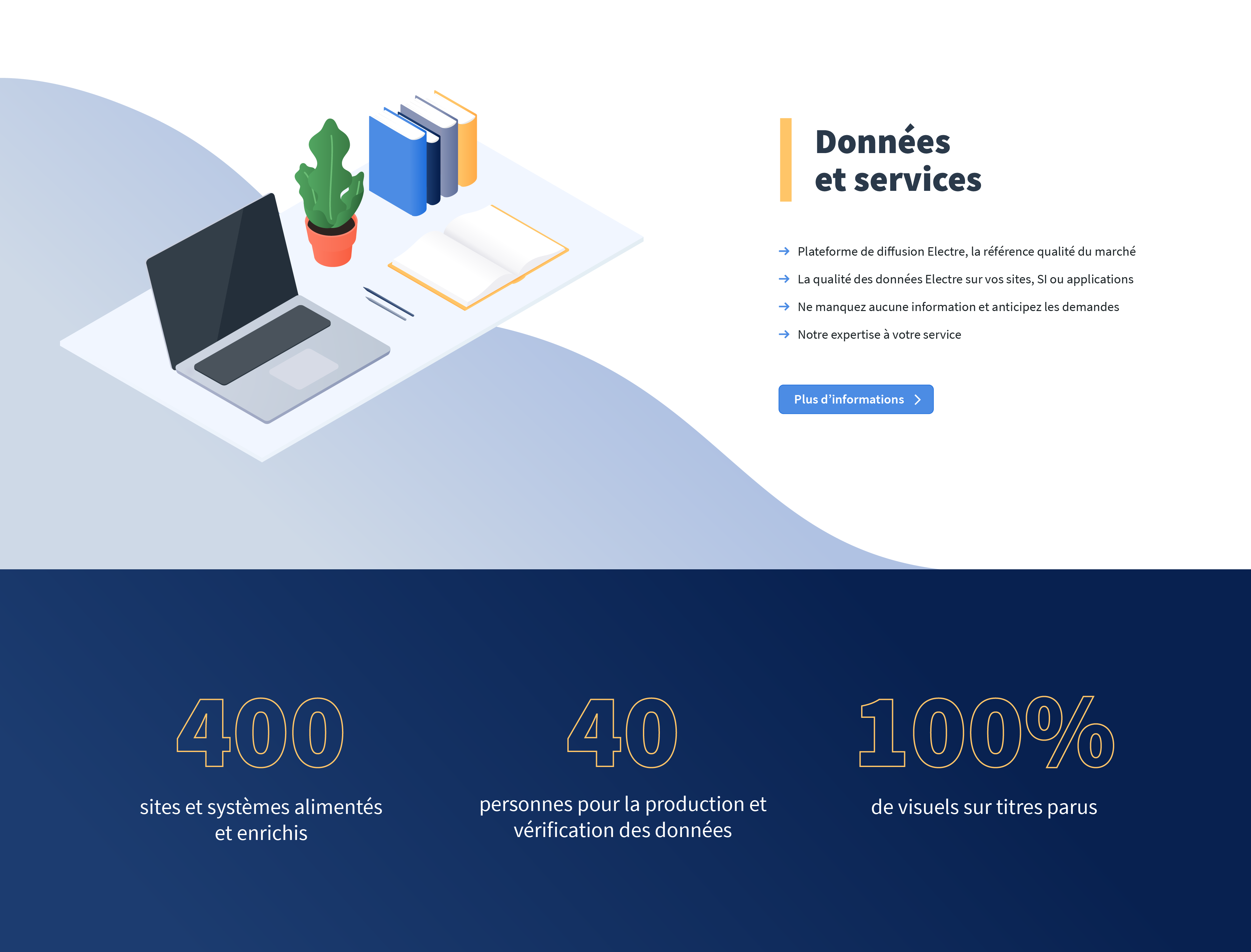
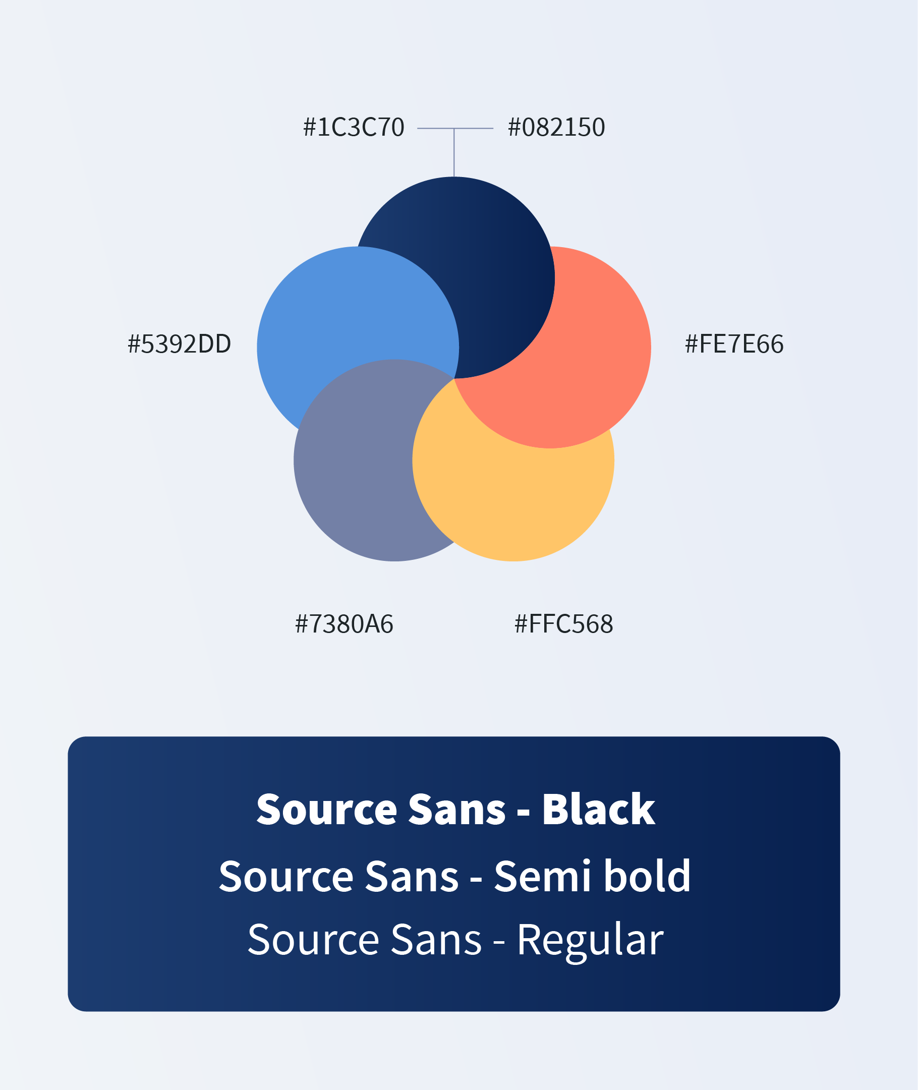
Starting an overhaul of their product, Electre wanted to modernize their image. Keeping the existing logo and staying close to the historic blue, I defined branding guidelines with a set of complementary colours and the Source as typeface. We decided to create vector illustrations, to bring the project to life.

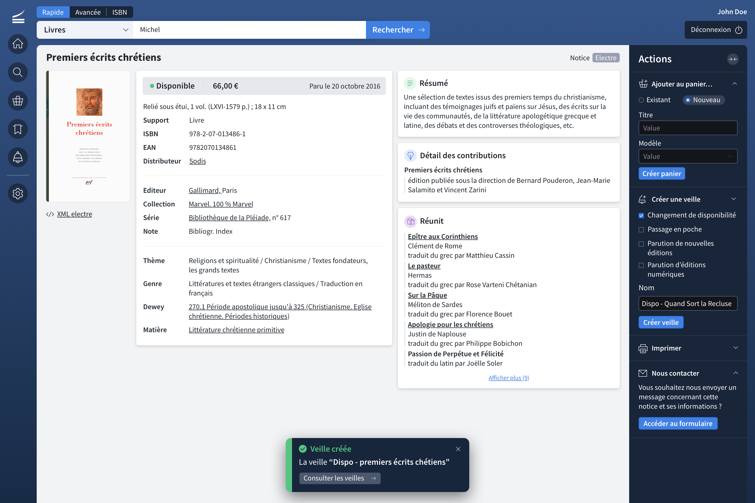
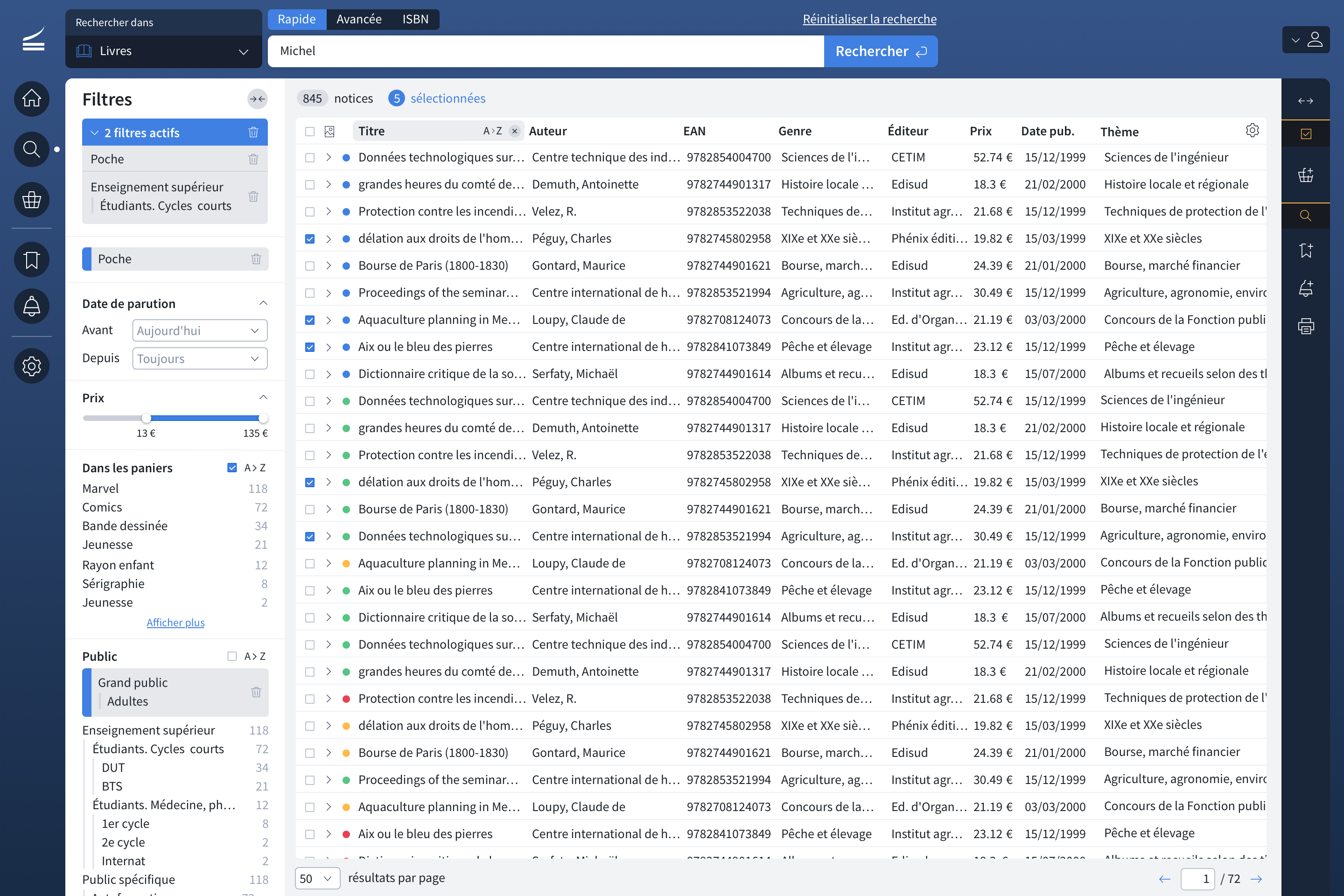
The product
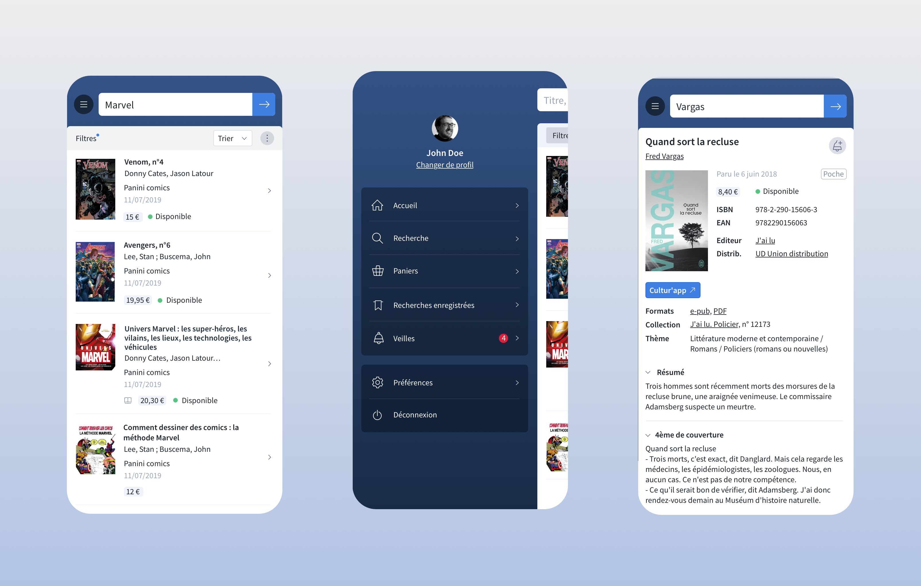
The main software offered by the company is a BtoB platform for libraries and bookstore. It contains a rich database, a search engine and various features dedicated to each type of user to help them optimize their workflow.
The redesign has been a milestone in Electre’s development, the previous version being used for more than ten years. We faced very interesting challenges while implementing previous features, improving their user experience and add new ones, all of it trying to create the smallest friction possible for the end user.